_Wearereasonablepeople (warp)
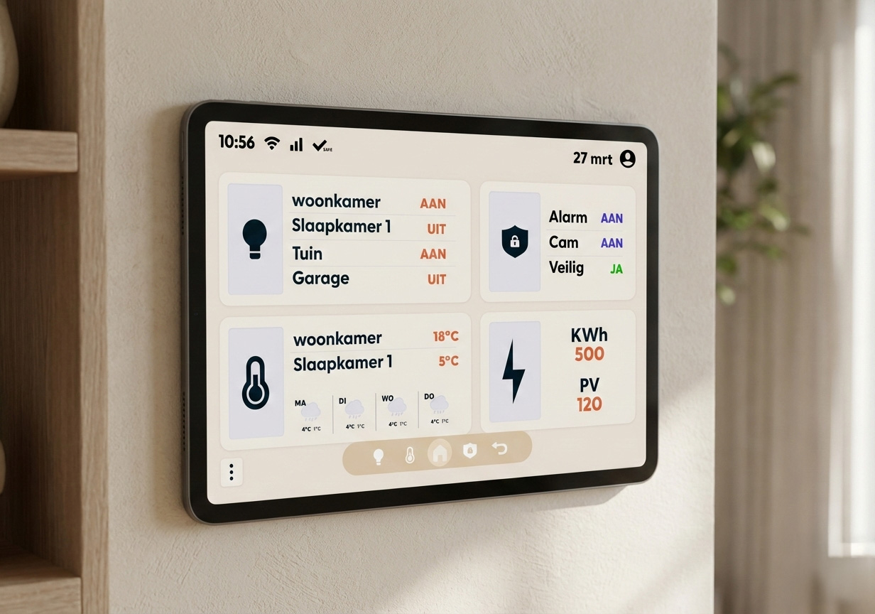
For the "Homecare" project, my team and I were asked by WARP to design a smart home management system. The goal was clear: create a user-friendly way for families to manage their electricity, water, and gas costs in one integrated system. I was responsible for the heart of the application: the Dashboard.
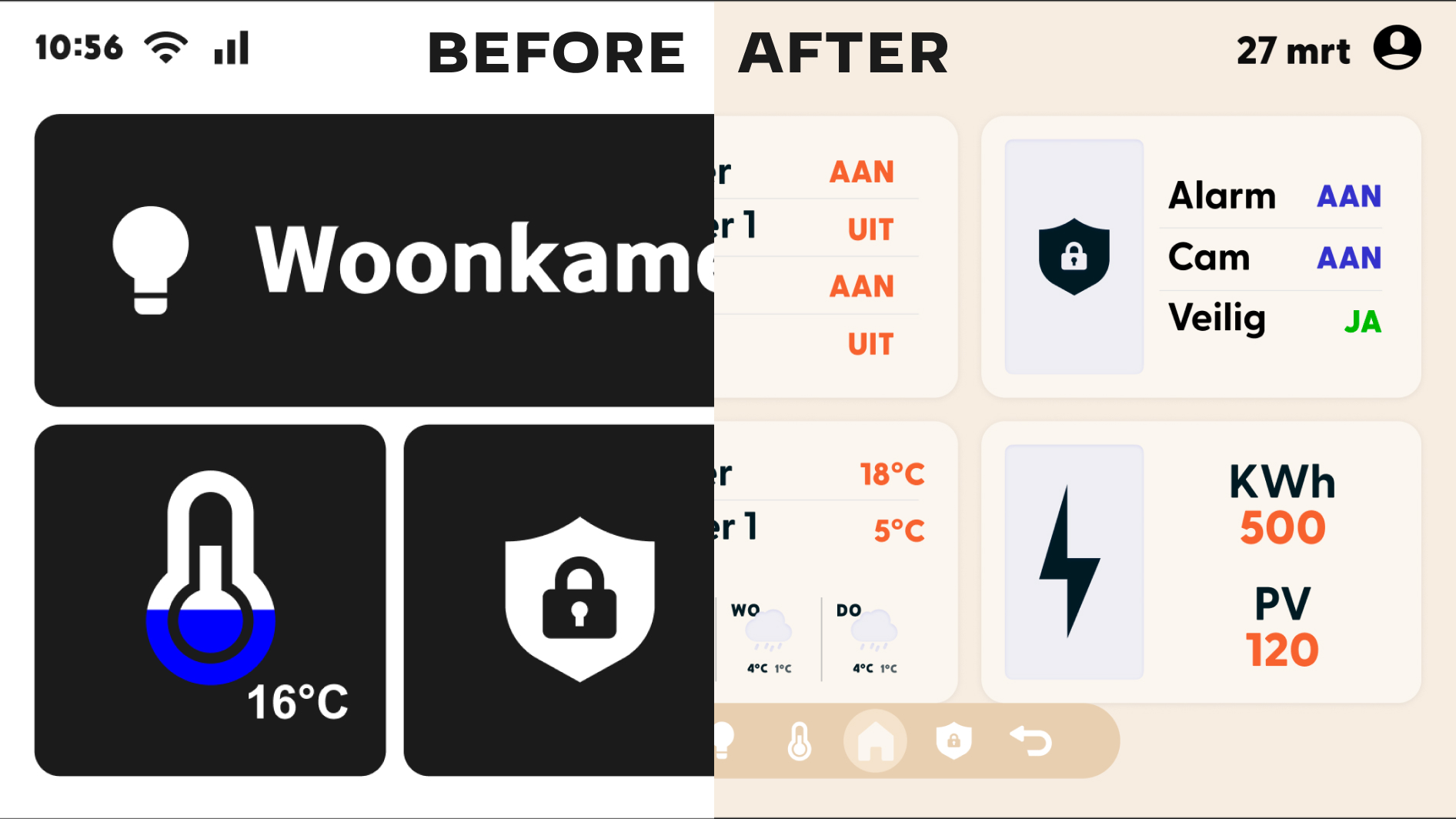
Because this project was highly visual, I spent my time prototyping and testing to find the best layout. The dashboard had to give users a quick overview of their energy consumption and easy access to lighting, security, and temperature settings.
My process followed three main steps:
Not every project starts perfectly. In the beginning, our team collaboration felt a bit "stiff" (or stroef in Dutch) because we didn't know each other well. We were all working on our own islands.
I decided to help change the vibe. We did a "names round" to get to know each other and started communicating more openly about our progress. By the end, we were checking each other’s prototypes in Figma to ensure the whole system felt like one product. My teammates even mentioned they appreciated how I kept track of tasks and helped everyone stay on schedule.
This project taught me the power of iteration. By creating multiple wireframes and testing them early, I could make design choices based on facts rather than just "feeling". It also showed me that a design is only as strong as the team behind it. When we started helping each other, the quality of our individual screens—and my dashboard—improved significantly.
Case Specs
Rol:
UI Designer
Tijdlijn:
10 weken
Tools:
Figma, Miro, Insight Wall
Expertise: